UI Re-Design & User Preferences
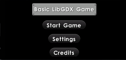
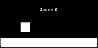

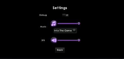
Hi! Welcome to my third post, if you have not read the previous posts, I highly encourage you all to skim over those first to get a gist of what I have been doing so far! Starting now, my posts represent the status of the project at the time the post was written. Also, from now on, I will post any additional snapshots of my game under its corresponding heading of the changes or additions I made. And yes, sorry for bombarding you all with changes but I will blog 1-2 times a week as too much frequency will result in not much content per blog, while it is also extremely time-consuming for me, and as a student, I don't have that much time. So it's essentially a win-win.
So What Did I Accomplish?
Again, as usual from now on, I will mark the progress made with headings and a relatively small paragraph underneath describing exactly what the title means.
Preferences Screen
I would say that this one is probably the most time-consuming and biggest additional feature that I was able to add to this game. The screen is actually completely done. Now as I add more features, we can expect to see the preferences screen grow. But right now, the preferences have everything the user currently would want under their control. The user can choose whether they want music and sound effects on or off, if on then to what volume do they want it at, and additional music setting in the form of a dropdown menu for the user to choose a song from. This song will be played when the user plays the game. There is also a debug checkbox, but that is really for me to use when doing some game debugging, and therefore will not be on the released version of this game. Here is what the screen looks like so far:
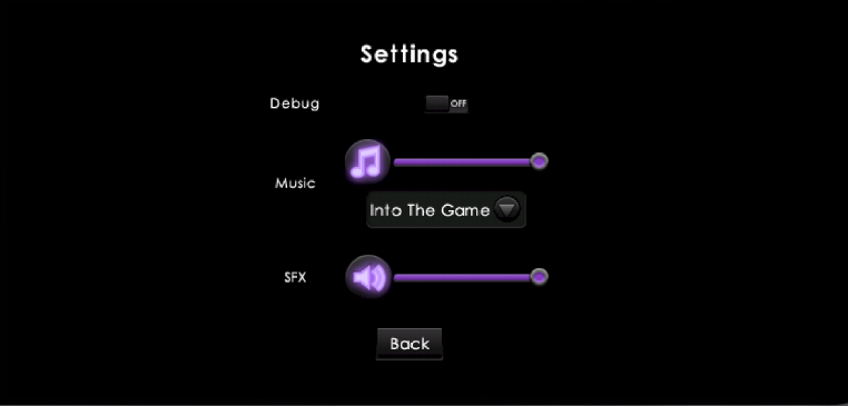
Shade-UI Re-Design
By now you must have realized that my buttons look different. That my buttons in the game used to be a glassy blue with white text, and it worked pretty well, however, it is not that pleasing as well. I was able to find a skin, a bunch of files that tell my game what each button and label should look like, called Shade-UI. This is an open-source skin that looks just amazing! It has a black, purple, and white theme as you could tell from the look of the preferences screen above. There is also an option for me to create my own skin, but that is one large deep end of the pool that I won't be diving into yet. Again, this is my first official game. Before this, I just messed around with the framework. I implemented the design change for all my screens and well, they look great! I may need to make a few tweaks here and there but so far it turned out great! Here is what the other screens look like:
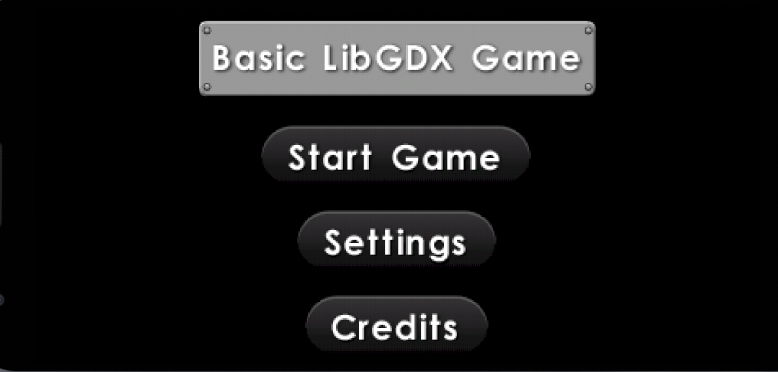

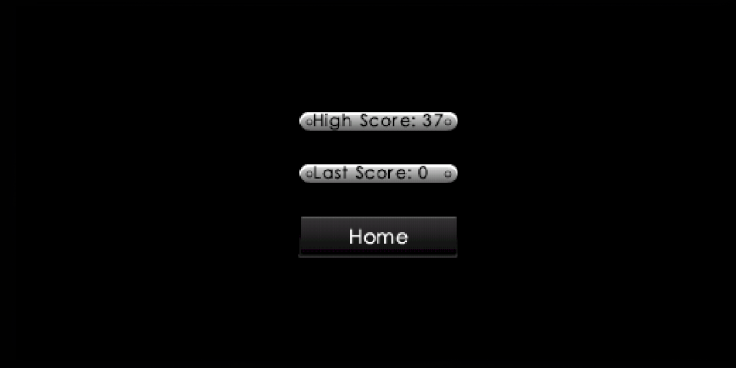
Credits Screen
You may have also seen that there is a credits button, but no credits screen under the Shad-UI re-design section. Well, that's because I haven't re-designed it yet! I don't have a picture of its earlier state with the old "glassy" looking skin, and I haven't finished the screen to implement the new "shade-ui" skin. This means that I essentially have no picture for you guys, sorry about that. To clarify, it would be extremely difficult to revert back the whole thing to glassy, and it is just much easier to change the skin and finish it completely, however, I did not want to delay this post as it is already extremely late, so please don't assume anything else. I really have not finished the credits screen yet, The inclusion of this screen now is because as it is getting closer to the time I actually release this game, I feel that I should make sure that I properly credit any and all sources that I used in the making of their game. That way I don't forget to do it later. It does like a dumb excuse, and well it is. I really just wanted a pretty chill addition like another simple screen.
And that wraps up pretty much any big changes that I have made. I cannot think of any more changes that I have made and for those changes that I did make but can't remember, well it goes to show that it just isn't important enough for me to remember. Oh, and before I forget, I also added a jump and whoosh (swish) sound effect, but not the click sound effect as I didn't see that as necessary. It is a very minor change I made, but it exists which is why there are even settings for them ("SFX").
What's Next? Goals & Plans
You may think, is the game ready for release? I mean the main part of the game is done, it does progressively get harder until it is at max difficulty, it has music and sound effects, all that is left is the Credits Screen, right? Well, your WRONG! Hate to break it to you all, but I plan on making this game fun and interesting, even though it's my first game. Just because it's my first game doesn't mean it shouldn't capture an audience. Here is a quick list of all the things I plan to do:
Fix the Loading Screen:
- Currently, I have a poor-looking loading screen with a white background.
- All it has is a still picture of a loading symbol.
- You can even see the border of the picture.
- I can't even show it as it's so embarrassing.
- Will add a cool progress bar, also part of the shade-ui skin, and spruce it up.
Add On-Screen Loading:
- FYI, the loading screen is meant to be used between screen transitions.
- However, there will be a time I need to load something during a screen.
- This is where a pop-up loading symbol will appear on the current screen.
Add a Pause Menu:
- Once the game starts, there is no way to pause the application unless you do the cheat technique.
- The cheating technique is where you force pause the application by looking at open applications.
- I will add an icon to the top right and hopefully, it should bring up a pop-up menu for some quick setting changes.
- I might add setting changes for all of the settings, or just some of them, like excluding the option to switch music.
- Since the screen is not changing, this is where I will need the on-screen loading.
New Feature: Sliding
- One of the coolest additions I would like to make by next time is a sliding feature.
- This is probably the biggest task of them all right now.
- The cube will almost be squished on a drag-down, making a jump a drag-up command.
- This would also require me to make floating obstacles for the player to slide under.
- I believe that this would be really cool and make my game more interesting to play.
That wraps up my blog post for today! Of course below this will be the links, sources, and credits (or simply mentions) for this post and my game in general. Hope you enjoyed this post, please follow my devlog, read my earlier posts if you have not already, and please leave any comments and questions you have. I would be happy to answer them. Again, one more shout out to SilentCrafter, who is the producer of all 3 soundtracks I have in my game currently.
Links / Sources / Credits
- Here is SilentCrafter's YouTube: https://www.youtube.com/channel/UCuwFIeJUww7GQZ8IH1F7SwA
- SilentCrafter's Discord server: https://discord.gg/U8EpMrd5
- For the sound effects, I got them from this awesome site ZapSplate: https://www.zapsplat.com/
- And If you are interested, be sure to also join the Libgdx discord server: https://discord.gg/8tcu8DC8
Agility Rush
My first game made using the Libgdx framework!
| Status | In development |
| Author | DinoSage |
| Genre | Platformer |
| Tags | 2D, libGDX |
| Languages | English |
More posts
- Game is Out!May 11, 2021
- Game Released!May 01, 2021
- The Lost HypeApr 13, 2021
- Back & Raring to Go 🕶!Apr 07, 2021
- LibGdx Game Jam BreakMar 25, 2021
- Sliding w/ Code LossMar 16, 2021
- Agility Rush Code-Rework?!Mar 03, 2021
- Progress Made! Strong Start and Still GoingFeb 14, 2021
- Starting Point - The Late PostFeb 12, 2021
Leave a comment
Log in with itch.io to leave a comment.